Mixing patterns and colours is one of my favourite things to do with design! With just a few skills, you can mix as many colours and patterns as you want. The possibilities are endless!
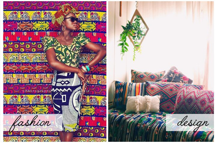
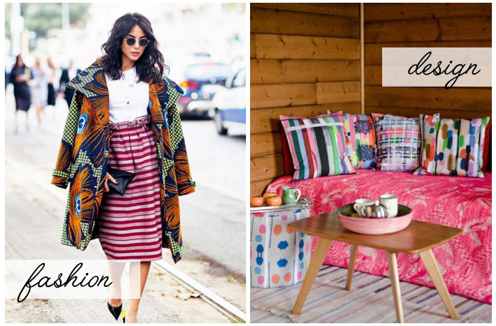
African/Tribal patterns are some of my favourite to work with. Typically, they’re filled with vibrant colours and great organic shapes. The key here is to stick within a single theme (in this case, tribal print). You don’t want to mix in a different print or style, like a polka dot. However, you can mix solid coloured pillows to break up the design.
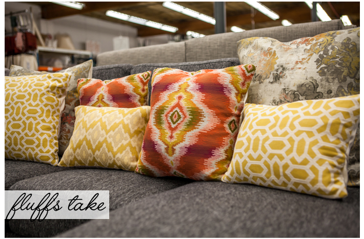
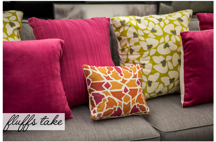
Using two (or more) bold colours in one space can seem like an odd idea. The trick here is to mix opposing colours on the colour wheel. It’s also important to keep colours in the same tonal range together. For example, you would want to work with all pastel, bright, or jewel tone colours. You can choose more than two colours, so long as it looks cohesive. There’s lots of information online for choosing colour pairings – so helpful!
3) Not your grandmother’s floral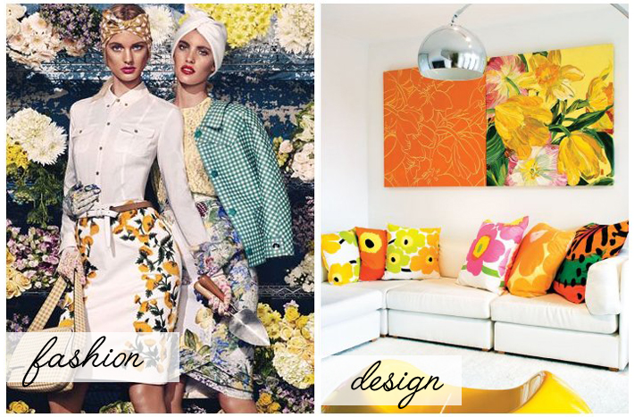
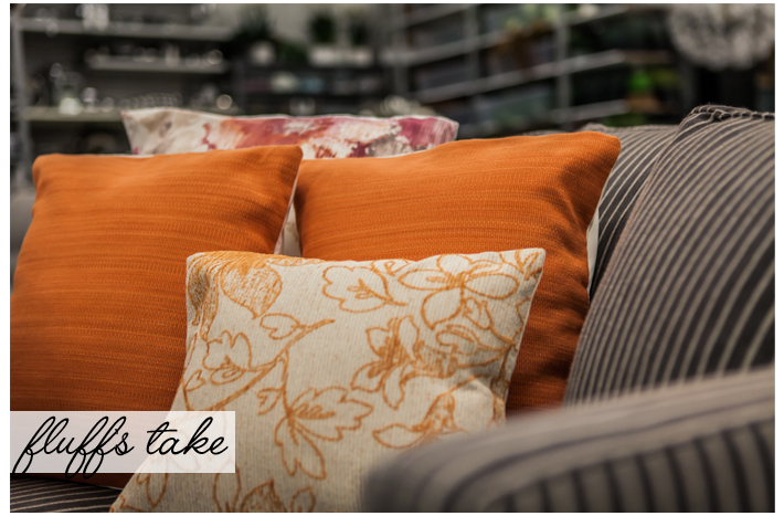
We love floral prints for interiors! They create a fresh and bright atmosphere in a space. Though if not styled correctly, floral prints can be interpreted as matronly or juvenile. We think it’s important to stick with 2 or 3 colours. Often times, they’re busy in design and speak for themselves.
We hope these tips help you to mix patterns and colour together! What is your favourite print to work with?

Add a comment
0 Comments