We are nearing the end of our Pantone Colour Report for Spring 2015. The last few colours are bright and very exciting to work with! This week we used Pantone Lavender Herb.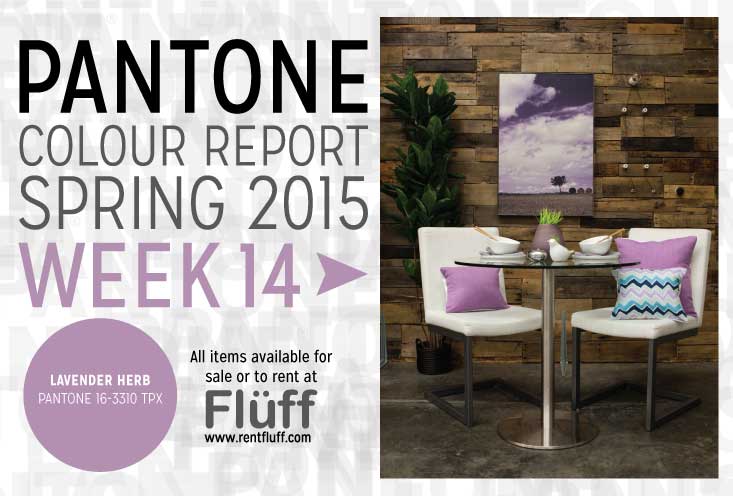
This kitchenette is a great pop of colour to have just off a kitchen. This fresh colour is unexpected, but so fun! Even though it is quite a “bubble gum” toned colour, the art and modern furniture break it up. These contemporary chairs are perfect for a kitchenette. They are substantial looking yet don’t take up too much space.
We love this art as it combines realistic and abstract elements. The colour matches perfectly to Pantone Lavender Herb as well! The pillows are textural and, again, the perfect colour. We used neutral colours on the table top, as we didn’t want to go overboard with this colour. Breaking up the table setting with wooden chopsticks, grey napkins, and some chrome accessories and greenery created interest.
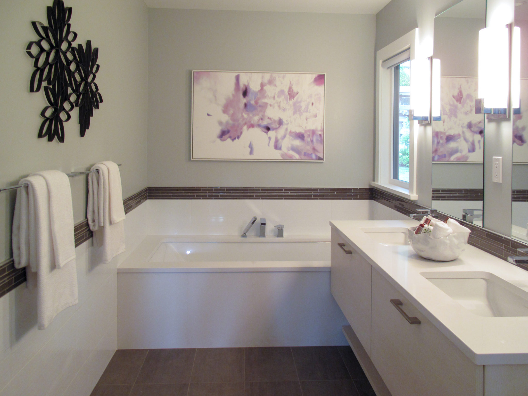
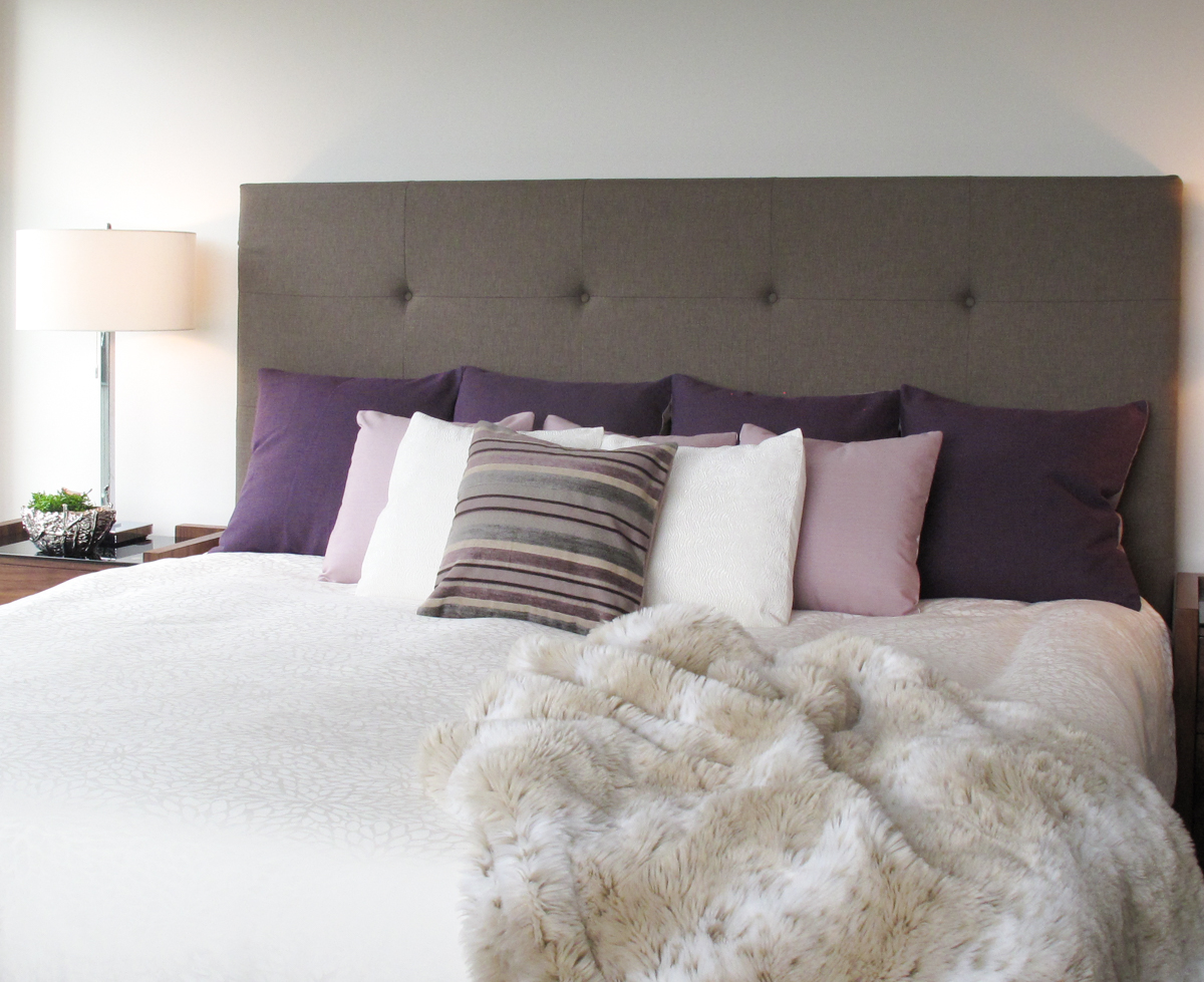
We think this colour is bold, but versatile! It would look great in a bathroom or bedroom as well. Here are a couple projects we used Pantone Lavender Herb in:
view the photo set here
view the photo set here
We hope you are inspired by this bright colour. We think it’s important to embrace bold colours rather than shy away from them. There’s a place for neutral, minimally designed spaces, but using colour is a great way to create impact in a space. Try it out!
 // Jordan – Marketing & Media, Bandit Pillows
")
")


Add a comment
0 Comments