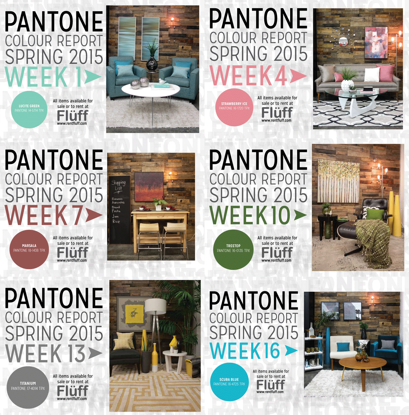
If you’ve been reading our blog lately, you’ve seen our Pantone Spring 2015 Colour Report posts. Each season Pantone releases a series of colours that will be on trend. We created vignettes to co-ordinate with each of the 16 colours. Here’s a recap of what we did: Being that there were 16 colours in Pantone’s Colour Report, we loved some colours….and disliked some. This proved to be a great challenge! A lemon yellow vignette (week 6) is something we wouldn’t gravitate towards doing, but it turned out to be one of our favourites! Some other favourite vignettes of ours were Tangerine from week 5, Lavender Herb from week 14, Scuba Blue from week 16! These were all vibrant colours, ones we wouldn’t pick to be our main colour to work off of.
We think each space ended up with such personality. We can’t wait to try to use some of these colours in our interior design and staging projects this Spring. We loved this concept of a colour report so much, we’ve created a special project for next week!
Stay tuned to see our exciting new weekly post for Spring.
 // Jordan – Marketing & Media, Bandit Pillows
Add a comment
0 Comments