This warm spring season in Vancouver has inspired us to use brighter colours and lightweight fabrics in our designs. Here’s a look at some of our colour inspiration.
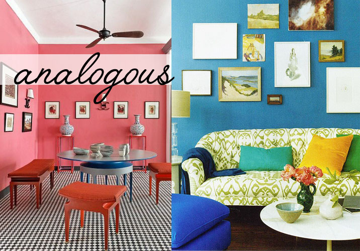
 We love these two spaces that use analogous colours (3 colours next to each other on the colour wheel, one being a dominant primary colour). The punchy red and pink space in the left image is a great display of how cohesive analogous colours can be. The image on the right has so many colours in one space, but works great together! We love both of these.
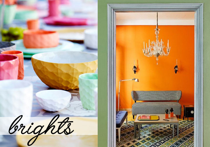
 The use of these bright colours are beautiful. We love the pile of ceramics in the left image. The colours work very well together. The bright tiling and wall paint in the white image are busy, but not overwhelming when paired with neutral furniture.
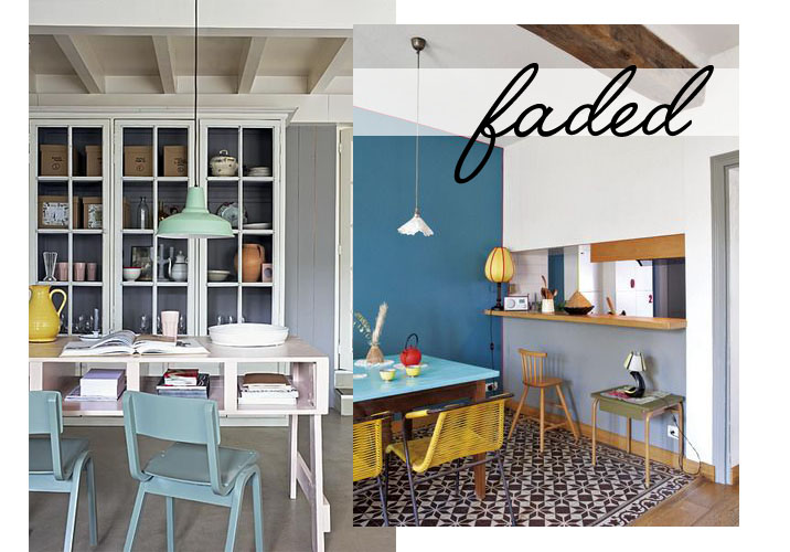
 This fresh pastel colour palette adds a retro feel to both of these spaces. The image on the left looks amazing with the matte finish throughout the room. The yellow chairs in the right image are amazing! We love the multiple wall colours.
We hope we’ve inspired you with these amazing spring-feeling colours!
 // Jordan – Marketing & Media, Bandit Pillows
Add a comment
0 Comments