With Pantone’s focus on a pastel palette for 2016, we’re sure to see an array of soft colours and patterns for spring. Here’s our top Spring 2016 interior trends.
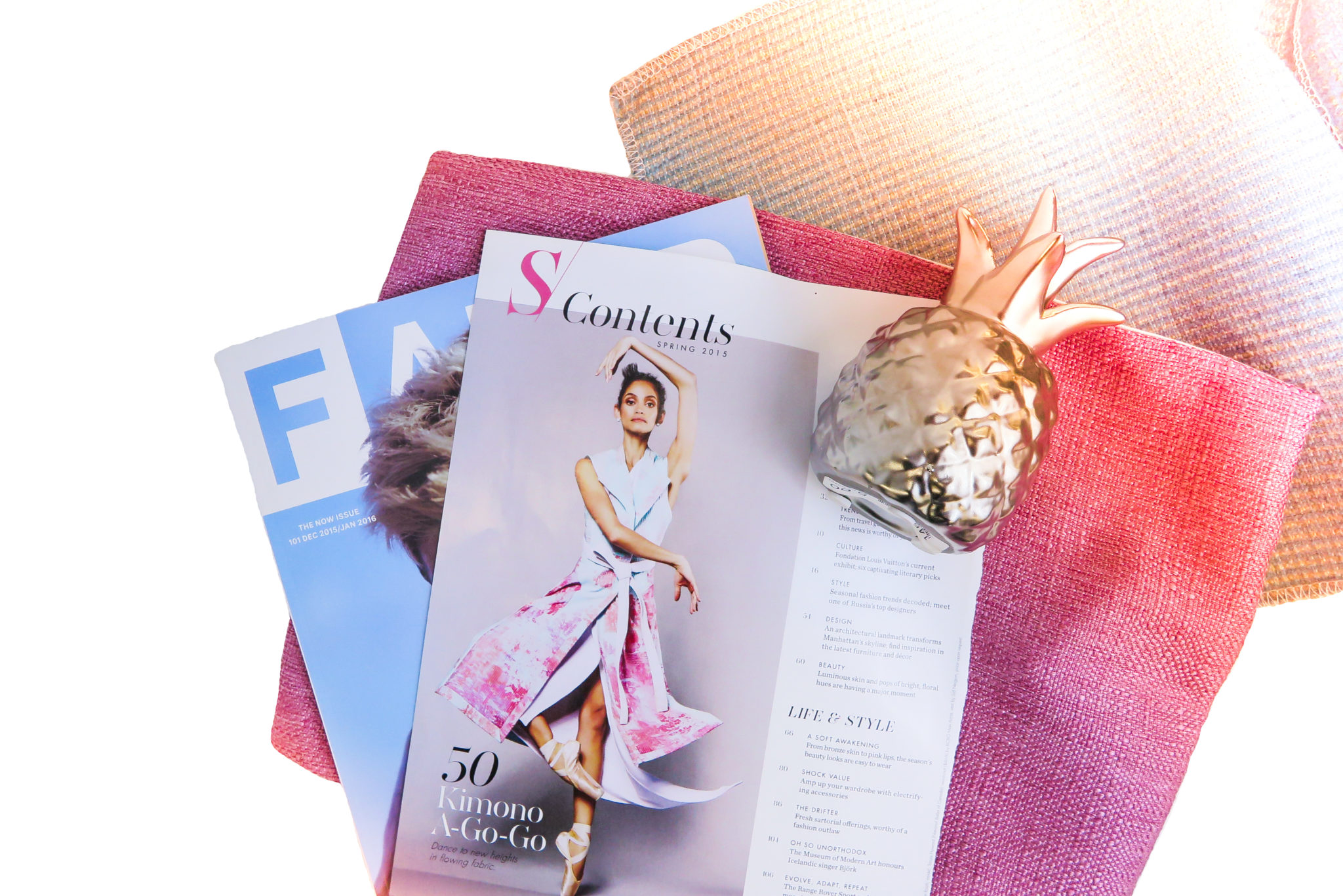
Each year, Pantone releases a symbolic colour selection that they see taking place in culture serving as an expression of mood and attitude. This soothing pair of colours is the perfect mix!
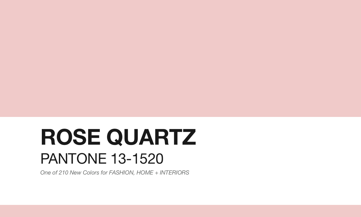
Pantone says, “Rose Quartz is a persuasive yet gentle tone that conveys compassion and a sense of composure”.
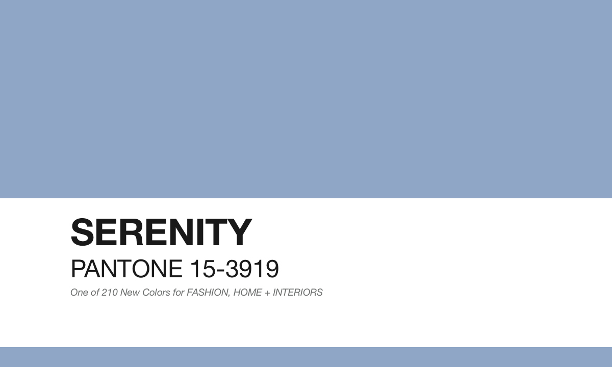
And, “Serenity is weightless and airy, like the expanse of the blue sky above us, bringing feelings of respite and relaxation even in turbulent times”. Rose Quartz and Serenity were the 2016 Colours of the Year. Although they’re quite washed out, we think they’re the perfect accent colours for interiors.
We love pink and blue accents, especially when broken up with neutrals like white and grey, and mixed with metallics like chrome. Add in natural wood pieces to soften up the entire look and create a cohesive space.
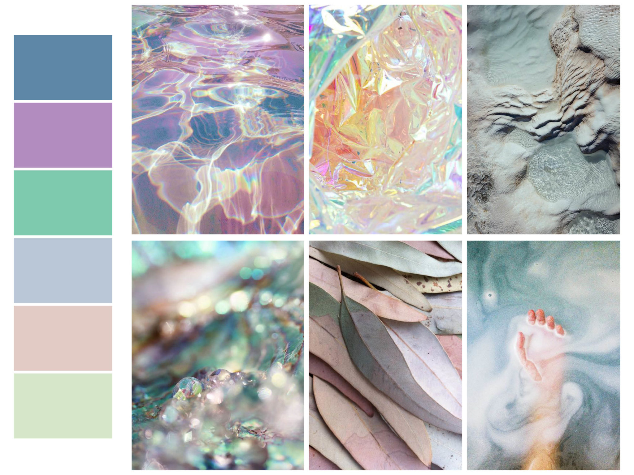
We think these are key pattern focuses for Spring 2016. We’re expecting to see soft, natural lines and shapes. Lots of round designs and repeat patterns. These are our top colours pulled from our inspiration images. An array of blues and pinks will be mixed together.
And if you feel like shopping for pieces now, here’s our favourite pieces available in stores now:
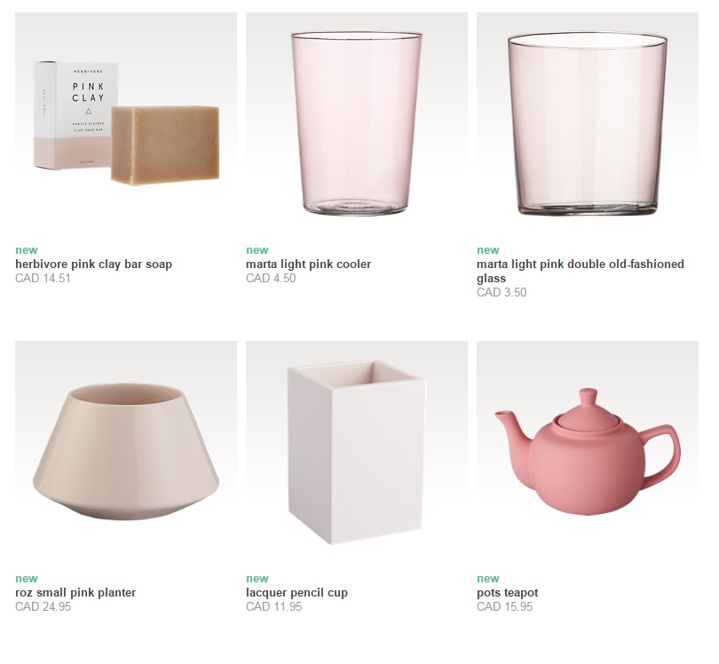
found at CB2
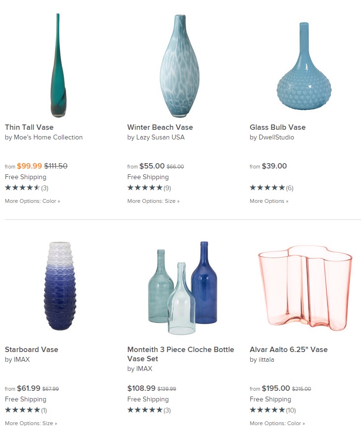
found at AllModern
We love the milky glassware and ceramic accents in these two tranquil colours. We can’t wait to start using these colours for staging projects! Which one is your favourite?
Check out our favourite rose quartz and serenity inspiration images on Pinterest below:
Follow Flüff Design and Decor’s board Design Trend – Pantone 2016 on Pinterest.
 // Jordan – Marketing & Media, Bandit Pillows
Add a comment
0 Comments