We are so excited about spring textures at Fluff! We’re inspired by the soft pink and blue released by Pantone this year. And we’ve picked patterns and textures to match!
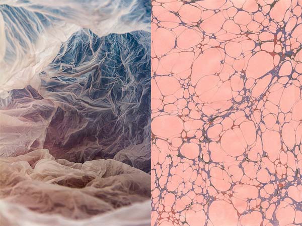
This pairing is the perfect mix of Pantone’s two spring colours, which you can see more of here.
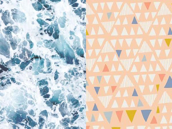
The crashing blue and white waves pairs perfectly with this fun triangle print.
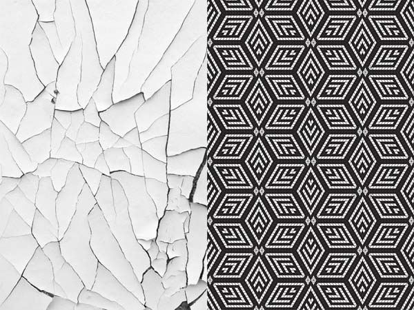
We think we’ll still see monochromatic hues this spring. Perhaps in softer shapes like the cracked white texture, or this traditional geometric tiling.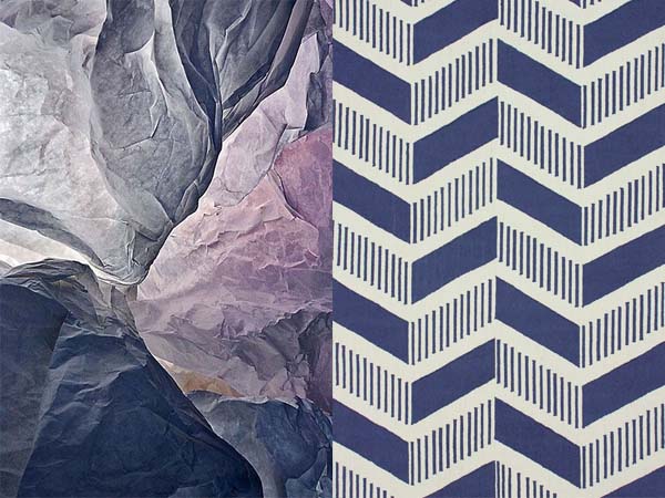
Some darker hues like this plum and navy mix will be seen as well. The updated chevron pattern is perfect for spring.
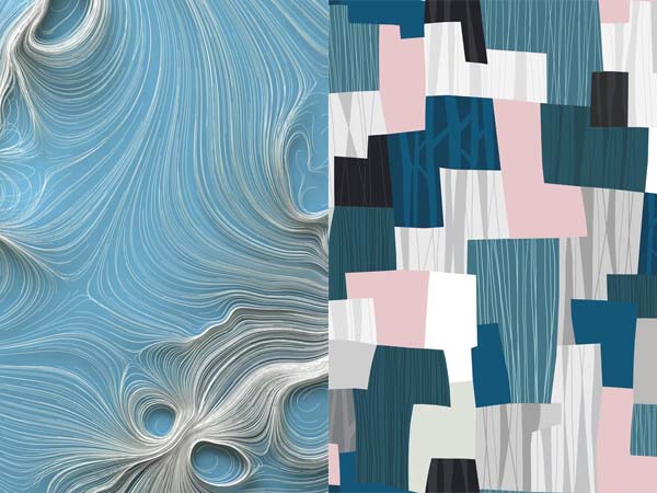
Soft blues and pinks are broken up with white, light grey, and taupe.
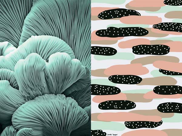
The folds in this textural shot are so stunning. Add in touches of this seafoam colour to liven up a space!
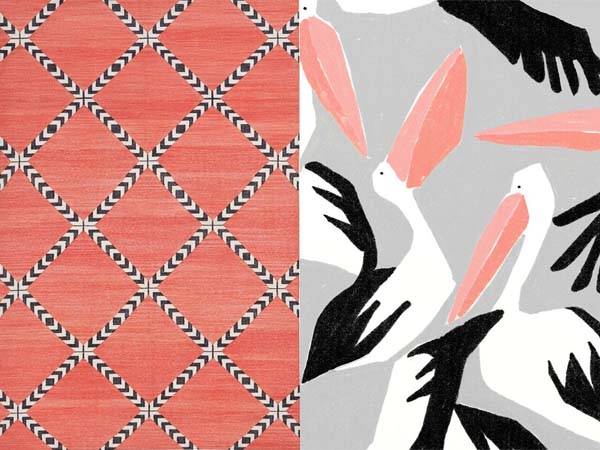
We still predict seeing tropical patterns for this spring. Although, they may be more oversized and with a different focus. Less pineapples, more birds!
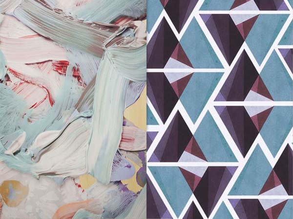
Of course, we love this painterly texture. The geometric pattern pulls out the colours in it perfectly. Busy textures and patterns can be mixed together if the colour palette has a consistent feel.
What do you predict will be big for spring?
 // Jordan – Marketing & Media
Add a comment
0 Comments