Colour mixing is the most fun part of design work! There’s endless combinations from quirky, playful ones to a blend of neutrals. Here’s our top colour pairings to try in 2016!
COOL TONES
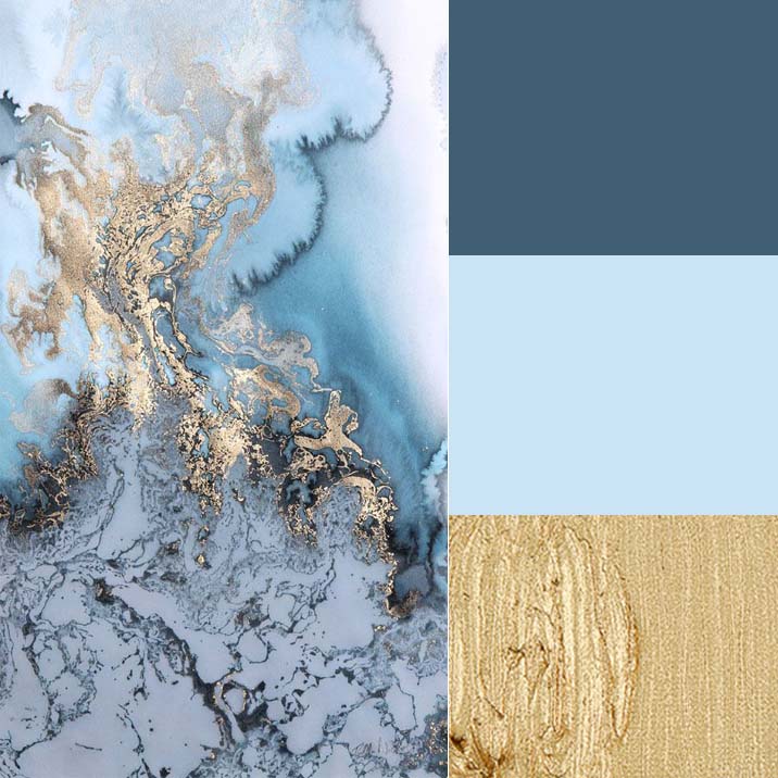
We love this sea of blue tones mixed in with gold. This would look amazing against dark grey and pale cream. See our blue colour story here.
WARM TONES
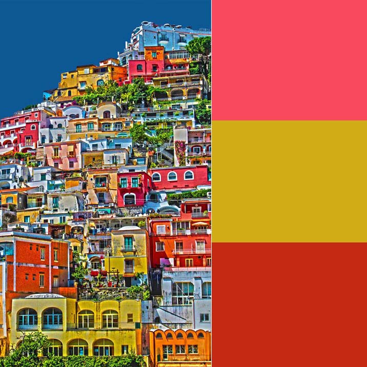
Bring warm tones like salmon, mustard, and paprika, into your home with textiles and decor accents. These pop against any surface colour and really bring life to your home. See more inspiration here.
NEUTRALS

Neutrals are always a good idea – they look perfect in any home. We’re seeing darker neutral tones replacing the all-white and cream look this spring. See our neutral Pinterest board here.
METALS
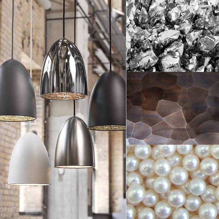
We’re seeing less rose gold and copper and more deep slate, pearlescent white, and bright silver. We love mixing multiple metals together to create interest.
Check out our mixed metal board:
Follow Flüff Design and Decor’s board Design Trend – Mixed Metals on Pinterest.
Which colour trends do you think will be big for 2016?

-Jordan, Marketing&Media
")
")


Add a comment
0 Comments