Flüff loves to stay on top of colour trends. When it comes to home staging using colour can be tricky. In markets with many different niches, like Los Angeles, it is possible to use colour more boldly because there is a more specific targeted audience and demographic.
In Vancouver we try to keep staging neutral in order to appeal to the largest demographic possible. That doesn’t mean that we can’t have fun with colour, but it does mean that we use colour differently than if we were styling our own homes. These are our favourite 4 colours of the moment and how we use them in staging vs. home styling.
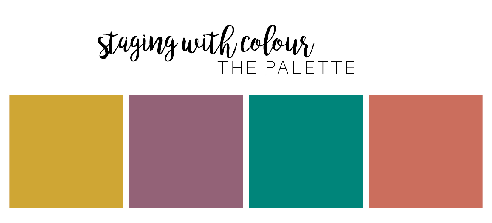 Wheat
Wheat
Wheat is one of the “it” colours at the moment because it is warm, inviting, and perfect for fall decorating. When we use wheat or gold in home staging it can be in the form of textiles or warm metals. 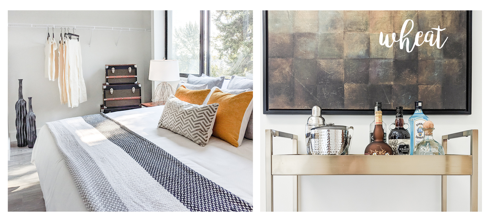
Pro Tip: A subtle whisper of colour is all you need to set the tone in a room.
Purple
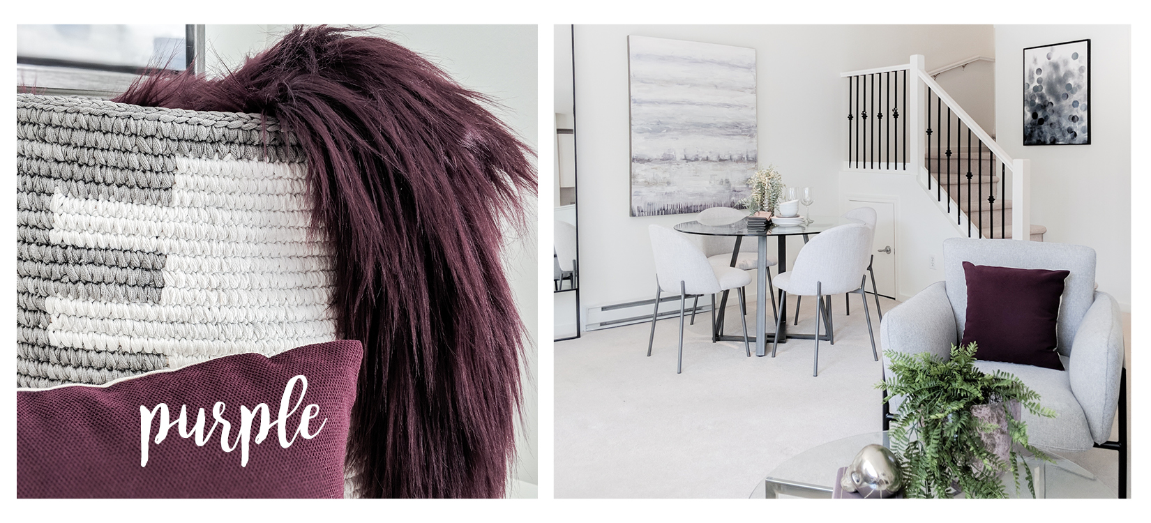
We have said it before, purple is a difficult colour to use in interiors. It isn’t particularly warm and carries an overtly feminine overtone. That being said it is one of our favourite shades and needn’t be left out of home staging.
Pro Tip: Use purple at minimum and pair it with cool, modern furniture. It can be especially effective with chrome and blue accents.
Terracotta
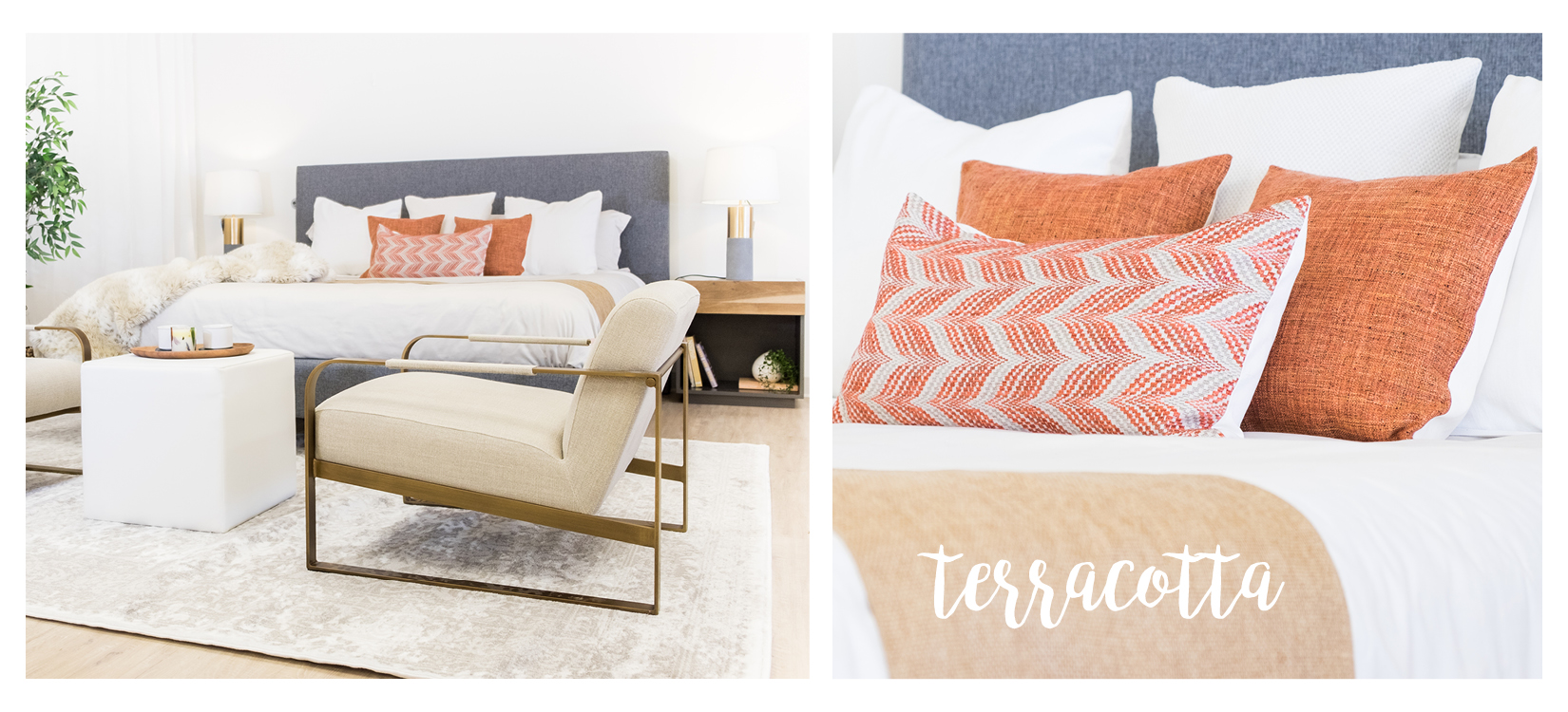
This is maybe the most popular colour this season and we are on board. Orange has been on the outs in design for the last few years but this more natural red/brown version is making it’s way back into style.
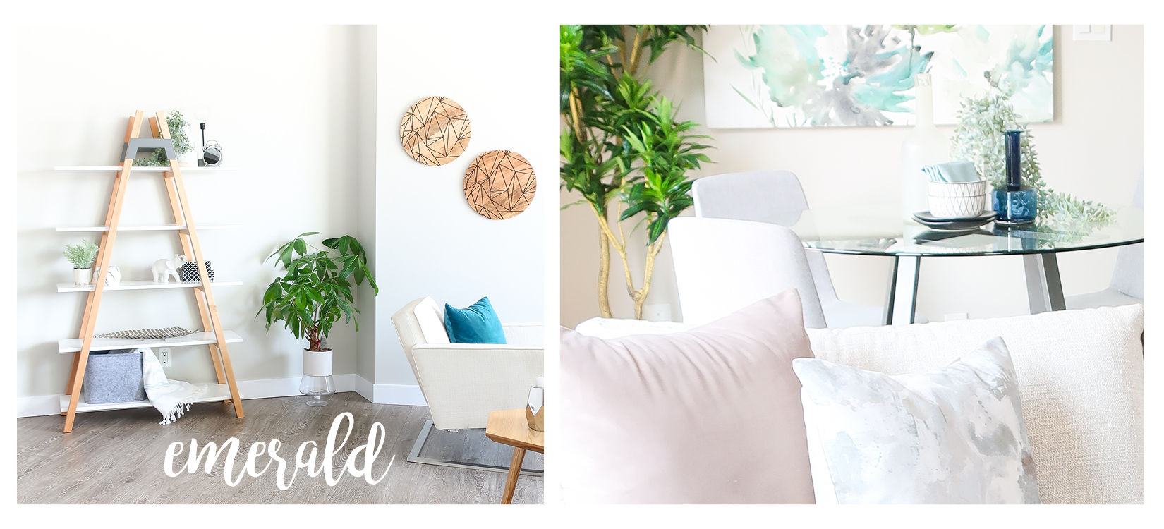
Emerald
Emerald is a dramatic hue, so we recommend that you use it judiciously in home staging. Try pairing emerald with a cooler blue tone for balance. Keep it modern and fresh with just a hint of deep drama.
Pro Tip: To keep the space light, pair emerald with creams and whites.
We love colour so we are happy to see it returning to home interiors. Show us your favourite colour and how you used it in your project! We’d love to see your style.
~The Flüffians
Add a comment
0 Comments