
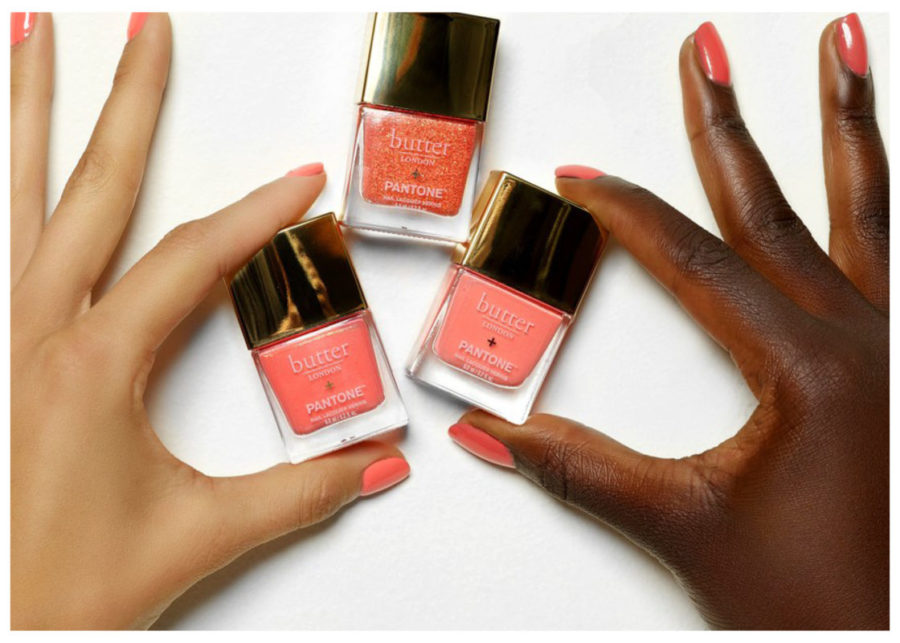
(Images from Pantone – Cosmetics Image from Allure)
Happy New Year and welcome back to the blog! We love to start the year talking about colour and colour trends. This year Pantone has announced Living Coral as the Pantone colour of the year for 2019. Living Coral is an optimistic colour and Pantone quotes it to be,
An animating and life-affirming coral hue with a golden undertone that energizes and enlivens with a softer edge
The conversation around the colour speaks a lot about climate change and finding a balance between online and real life. The colour symbolizes “an innate need for optimism and joyful pursuits”. We are interested to see how the colour translate to modern interiors, and if it catches on with the continued popularity of more muted tones.
Beauty
Firstly we can say that it is a beautiful colour and much like Ultra Violet, last years colour, we think it will be huge in the fashion and beauty industry. In fact, Pantone has already collaborated with Butter cosmetics on a line of coral nail polish and lip colours. The colours are gorgeous and the marketing is on point. It is sure to be a hit, especially in the summer months.
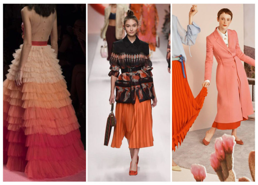
Left to Right Designers: Elizabetta Franchi, Fendi, Caroline Herrera
Fashion
It is also safe to say that coral is hot in fashion with many of the major designers introducing it for spring. Everyone from Marc Jacobs to Caroline Herrera have coral represented in their collections. It is a flattering, fun colour, easy to wear and ultimately likable.
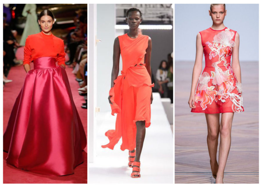
Left to Right Designers: Brandon Maxwell, Sies Marjan, Valetin Yudashkin
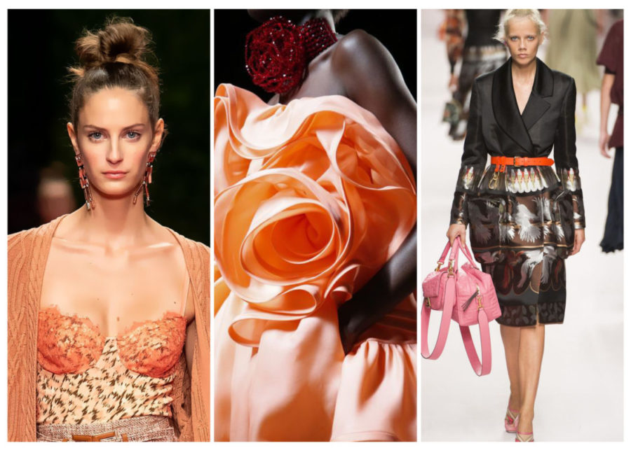
It looks like designers are interpreting their own versions of coral with pink and orange pairing nicely with the hue. It is ultimately a feminine colour so we expect to see coral in accessories, lingerie and shoes as well.
Left to Right Designers: Elizabetta Franchi, Mark Jacobs, Fendi
Interiors
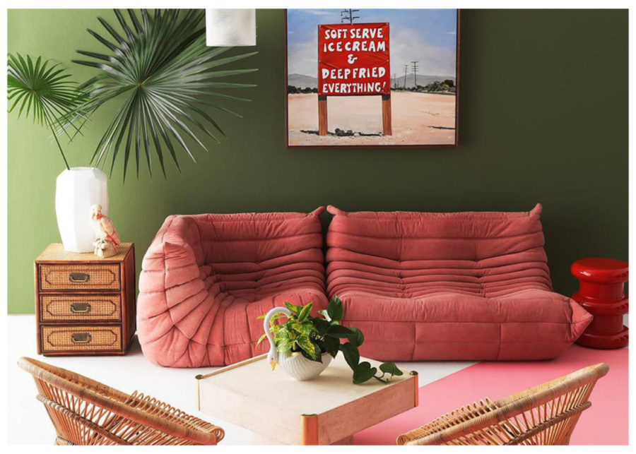
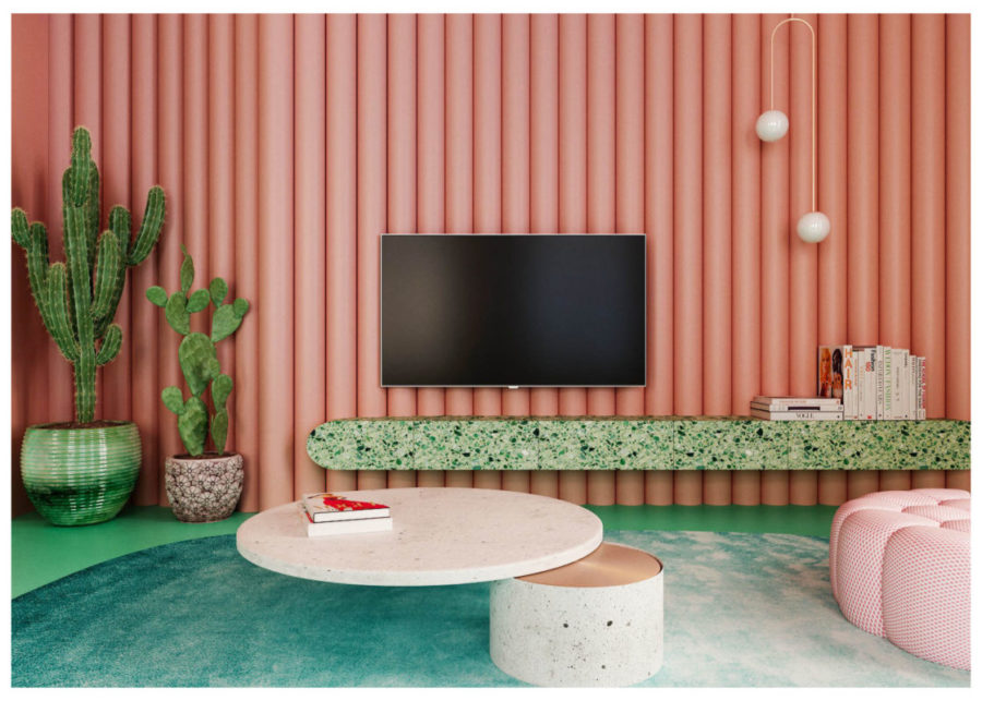
Looking at coral for interiors we start to see a natural pairing with a deep green. We love the trend toward dramatic, Art Deco styling and coral gains sophistication from a complimentary deep colour pairing. These two images featured on Dezeen are our favourite inspiration for the coupling, however the Flüff version will be a more muted version of these daring designs.
In many ways coral is just a slight adjustment from the muted pink that has been so popular in the last 2 years. We expect to see more of this version of the colour in homes as it’s popularity is still in full swing.
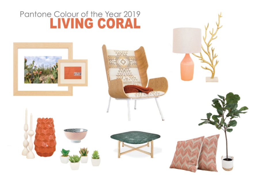
Flüff – Living Coral
Chair and Table by Gus Modern* – All Items available at Flüff Designs
Here is a quick style board with some of our coral inspired inventory. It is always a fun and friendly colour to add to a staging project, especially in kids rooms and bedrooms. Look for the colour in artwork and photography where it comes through in an organic and natural way. After all, living coral really does come right from nature and a need to hold on to the magical elements of our living planet.
Until next time,
~The Flüffians
Add a comment
0 Comments